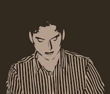
I figure some people might want some idea what I look like. I'm trying to stay anonymous but I have made a few attempts at making a likeness of me that is highly stylized so it isn't perfectly clear who I am. The first attempt looked too much like me so I tried making a mask like the Phantom of the opera. It looked cool since I knew what it was suppose to be but I thought some people might not understand what I was trying to do and I didn't feel like explaining it all the time. The next attempt turned out rather nice and I played with it some more by adding in lips, a nose, and a more complete jawline.
I think the image gives a pretty good idea what I look like without revealing enough information for anyone to ID me outright. I debated the colors to use and decided the brown on brown was a very popular color scheme. I almost went with the red and blue superman colors since I am going that route. Speaking of Superman, if he can clean up his hair and put glasses on to fool the world's best investigative reporter Louis Lane then my image should hide my identity rather well.
So what do you think?
OK, I've made a new image. I don't know if I like it. It is less dark for now but I don't know if it is any better. What do you think? Let me know in the comments.
This is my first draft of super youth pastor. You can't see the logo too well so I'll post it below.
Don't forget to let me know which image is best. Maybe I should just use the SYP logo.
Thursday, January 29, 2009
Subscribe to:
Post Comments (Atom)


6 comments:
Thanks for helping put a "face" to your person.
Honestly, it looks kinda evil, lol. It makes me think of the Joker from the darker Batman cartoons.
I was going for the graphic novel feel, but I guess I landed in the wrong camp. I think I'm going to have to create a Super Youth Pastor image modeled after myself. I do want the darker grittier feel but the good guy look not the villain.
I actually like it alot. The second one looks as though one of his arms is half-missing! Oh no!
But, the effect is awesome. Good work. Perhaps, to lighten it up, try a different color scheme. That might work to brighten the mood.
Good luck! Looks like you've got some awesome ideas!
wv: fiesses
Fancy, French poop.
bman,
Thanks, I'm partial to the first one. I don't see the half the arm is missing but I do see that the symbol isn't lined up right. Oh well.
definetely the second one is cooler. You really look like a super hero for sure. and the logo is awesome.
Bethany,
Thanks, I might use it after I play with the look a bit more. I'm not happy with the face at all. I also see some other things that need tightening up. I might have to go and buy some comics since mine were stolen years ago. Then I'll get a better idea of how to draw that style and exactly what style I really want.
Post a Comment